Create, Collect, and Analyze Surveys and Web Forms

Graph
The Chart Legend and Chart Graph share the area between the chart title and chart footer. The software determines the required width and height needed to display the legend items properly. The legend position, length of text choices, and other selected options determine the legend sizing. The remaining area is used for the graph region.
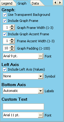
Use Transparent Background
When this check box is marked, the graph background color matches the chart background color. If the checkbox is not marked, the graph background will be white.
Use Graph Frame
The graph frame is a rectangle marking the border of the graph region. If this checkbox is marked, the frame is drawn. If Hide All Frames on the Background tab is marked, this check box setting is ignored. The width of the frame lines can be varied from 1 to 3 pixels. If no legend is visible, the graph region expands to occupy all space between the title and footer regions located at the top and bottom of the chart, and the bevels located on the left and right sides of the chart.
Use Graph Accent Frame
The graph accent frame is a rectangle located inside the graph frame. If this checkbox is marked, the frame is drawn. If Hide All Frames on the Background tab is marked, this check box setting is ignored. The width of both frame lines can be varied from 1 to 3 pixels.
Graph Padding
The graph padding is the number of pixels between the graph frame and the graph accent frame. The graph padding can be varied from 1 to 100 pixels.
Graph Font
Clicking the button on the right side of the font combo box displays a font dialog. You can select a new font, font style, size, and color. This font selection is used for left axis values, bottom axis category labels, and graph data markers.
Pie Charts
A Pie Chart can only display one numeric series at a time. If the chart data is from a multiple series, separate pie charts are created for each data series. Chart titles are automatically changed to reflect the different data series being graphed.
Cross-Tab Axis Labels
Cross-Tabulations show relationships between responses for two survey questions. Microsoft defines charts showing a relationship between two sets of responses as Pivot Charts. Topic phrases entered for each question on the Design Menu - Edit Questions - Option/Values tab are displayed by the cross-tab left and bottom axes. When selected rows or columns are used, additional text is added to the displayed label. Clicking the button on the right side of the font combo box displays a font dialog. You can select a new font, font style, size, and color.
Left Axis
The left axis caption used by cross-tabulation charts is automatically determined by the survey software. The survey software automatically determines the Minimum and Maximum values, and Major numeric units to display by the left axis. When horizontal bars are used, the bottom axis and left axis swap positions.
Include Left Axis
If this checkbox is not marked, the Left Axis values and Left Axis Caption (Cross-Tabulation Charts) will not be displayed. If this checkbox is not marked, the Left Axis values and Left Axis Caption (Cross-Tabulation Charts) will not be displayed. The left axis caption is determined by the survey question topics and text choices.
Symbol
The Dollar ($), Euro(€), or Pound(£) symbol can be placed adjacent to the left axis value. Placing the symbol here can create less clutter in the graph region.
Bottom Axis
The bottom axis caption used by cross-tabulation charts is determined by the survey question topics and text choices. Question topic phrases are entered for each question on the Design Menu - Edit Questions - Option/Values tab. When horizontal bars are used, the bottom axis and left axis swap positions.
Bottom Axis Font
Clicking the button on the right side of the font combo box displays a font dialog. You can select a new font, font style, size, and color.
Bottom Axis Labels
These labels are sometimes called category labels. The labels are determined by your survey question text choices. Sometimes long text descriptions on the bottom axis of a graph will not display properly in the allowed space. Automatic attempts to display the text with multiple line word wrapping. Matching letters in the legend box with letters along the bottom axis creates a more appealing chart. Labels can also be displayed on Alternate lines, or on single lines with three dots indicating shortened text.
When editing survey questions and text choices, clicking the button to the right of the Clipboard Paste button reveals a second grid column. The column to the right of the Text Choices is for shorter text choices. Chart text is used for labels on charts, and displayed when selecting question parts. If left blank, the text choice from the first column is always used. For example, the text for a question choice could be 'Willingness of manager to provide positive recognition'. That long choice on a chart would not be an appropriate label. The choice topic 'Positive Recognition' would fit better. Chart text is also used in some report column headings.
Custom Text
Custom text can be placed at the top of the graph region. The height of graph drawing will decrease to accept the extra line of text. Clicking the button on the right side of the font combo box displays a font dialog. You can select a new font, font style, size, and color.